An All-new Student Portal
OzTREKK student portal helps Canadian applicants manage documents and stay connected with OzTREKK and its partner schools during their study-abroad process.
1,500+ Active users
1,00+ User flows
10,000+ Components, icons and variants
50% improvement in design to dev handoff

Team
Noah Mah, Lead Product Designer
Josh Chalmers, Product Owner & UX Research
Cailine Keirstead, Product Designer
Amanda Bicalho, Product Designer
Aksel Roughsedge, Lead Full-stack Developer
Jeremy Atkins, Backend & API Developer
John Xiang, Frontend Developer
Jesse Ramey, Frontend Developer
Timeline
Over 6 months (late 2023 to 2024), my design team in collaboration with Research and Dev teams conducted user research, surveys, testing, design, and rapid prototyping.
Status
The project went live in the second half of 2025 and is in active development.
Overview
The OzTREKK Student Portal is a web-based platform that streamlines the complex journey Canadian students face when applying to universities in Australia. As the lead product designer, I was responsible for driving the product vision, shaping user experience, and delivering an intuitive portal that simplifies application workflows, centralizes document management, and enables seamless communication between students, the OzTREKK team, and partner schools.
I led the design strategy from discovery to handoff, aligning design solutions with business and user goals while improving usability across key student and advisor touch points. The newly designed experience focused on clarity, accessibility, and reducing friction throughout the application lifecycle.
Upon handoff to development, we ensured at least 80% of the UI was covered by reusable design system components and tokens. To accelerate development and improve collaboration, we used the Bubble development platform as the source of truth for the design system. This approach also enabled us to build a fully interactive prototype with dynamic data, allowing developers to experience the full user flow and logic we designed with context. By eliminating the traditional translation process from Figma to code, we reduced development time by 3+ weeks (a 50% improvement over similar projects and timelines in my team’s previous experience) and significantly streamlined communication and handoff between design and engineering.
The Problem
For Canadian students interested in studying overseas in Australia, the application process can be confusing and fragmented. Although Australia offers world-class education, the path to enrolment is filled with logistical and legal hurdles that are not well understood by most Canadian applicants. They often face difficulty finding clear, Canada-specific guidance on how to choose the right program, understand entry requirements, or preparing supporting documents. Without an agent with a centralized platform tailored to their needs, they’re left relying on scattered information from university websites and forums. This lack of clarity and support not only causes delays and missed deadlines, but also leads to avoidable stress and, in many cases, abandoned applications.
User Challenges
The application journey for Canadian students is complex. Students must manage multiple moving parts across various university portals, immigration websites, and external communication channels. From submitting documents to monitoring deadlines and corresponding with advisors, each task happens in a different place, often with no clear system tying them together.
Most students have to dig through long email threads, build personal spreadsheets, or follow static PDF checklists just to stay organized. The process of applying is often prone to error and offers little visibility into what’s completed, what’s outstanding, or who to contact for help. The lack of real-time status updates, integrated communication, and guided workflows results in a frustrating experience. Many prospective students end up missing steps in their applications, have long delays in submissions, or just abandon applications and give up.
Who is OzTREKK?
OzTREKK is a Canadian education agency that specializes in helping Canadian students apply to school programs at Australian universities. Every year, OzTREKK guides thousands of students. They help at every stage of a student’s application process, from choosing the right school to submitting applications, preparing for interviews, securing student visas, and relocating to Australia. Their services are free for Canadian students. OzTREKK partners directly with Australian universities to provide students with the best application and studying experience.
Pain Points
Excessive time manually tracking progress, chasing students for missing documents and answering repetitive questions
Fragmented tech stack that did not communicate well with each other
Clunky Salesforce integration with their existing tech stack
Limited tools for automating or scaling support across hundreds of students per cycle
Multiple student portals that tracked different tasks and documents
Communication lost in email threads, phone conversations, or hidden in Salesforce notes
Expensive supporting multiple platforms and paying Salesforce developers for minor changes
Opportunity
Frustrated by all the pain points in their process, OzTREKK reached out to my employer at the time, StayShure, to explore a potential solution. As the design lead, I guided our team in identifying an opportunity to create a unified student portal that would streamline key aspects of the student experience. Our goal was to reduce advisor workload, improve Salesforce workflows, and deliver a more user-centred experience for their students and applicants.
Research and Exploration
To understand the challenges faced by students and advisors, we began by conducting stakeholder interviews, reviewing existing workflows, and mapping the application journey. The goal was to uncover pain points, inefficiencies, and unmet needs across the student and staff experience. Through this discovery process, it became clear that the lack of centralized communication and progress tracking was a major source of friction. These insights shaped the foundation of the portal’s core features and helped prioritize what we needed to focus on in the design.
What actions were our users taking?
It was important to understand the actions users were taking. Our team wanted to scope how large the project could become, identify redundant actions, locate missing actions, review content, ideate flows and understand information hierarchy.
We started with leads and prospects. This led to discovering how users were registering for OzTREKK’s services and enrolling in each of their different student portals. We found users had to go through multiple sign-up forms and email verifications. Many of OzTREKK’s current solutions had poor UX as well which led to a lot of support inquiries in the early stages of a student’s journey with OzTREKK. By simplifying all the student portals down to one platform, we could save students time in redundant signup processes and the OzTREKK
team days if not weeks in support inquiries.
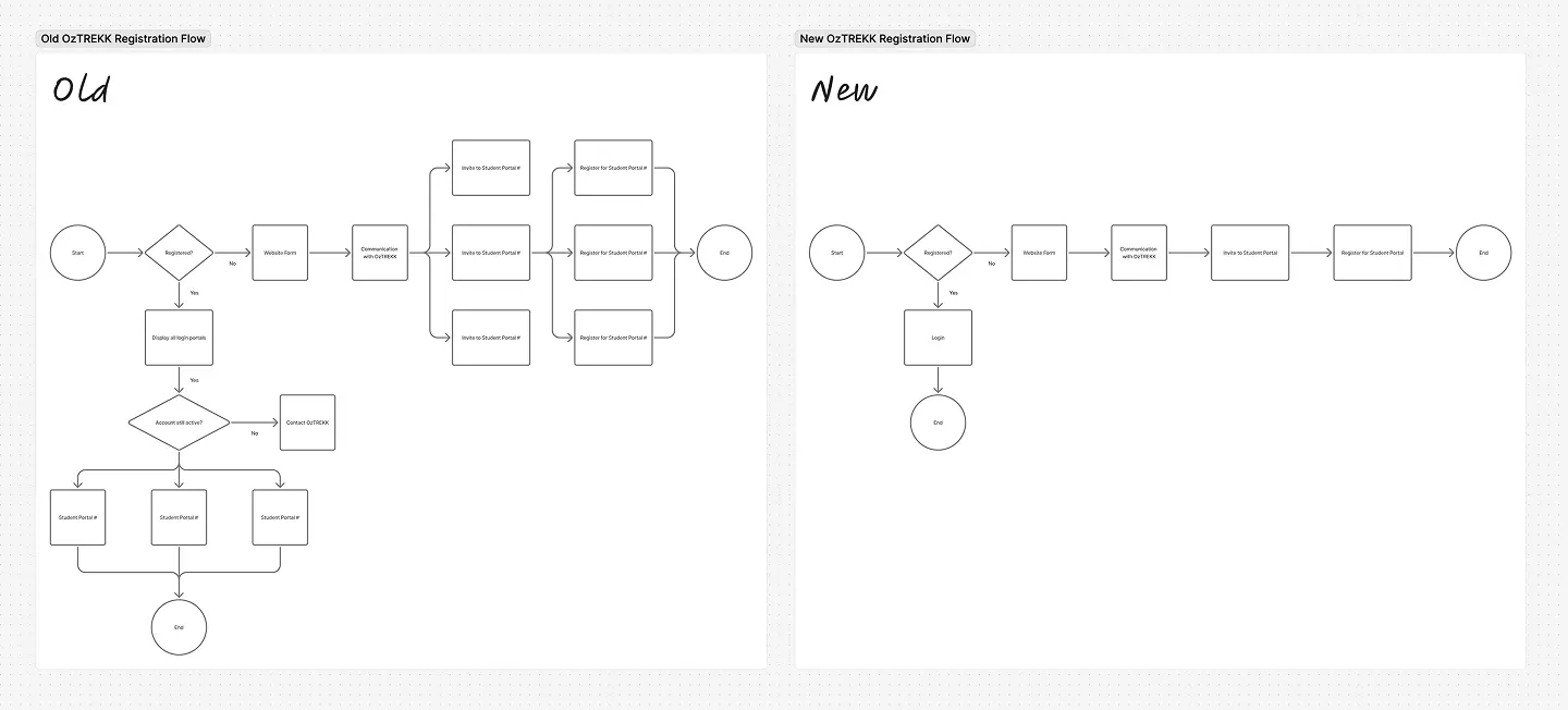
Next we reviewed all the screens, states, workflows, and actions that were part of their current workflow and student portals. We looked at user visibility as well. In this process, we were able to quickly figure out what pages/features were needed, which ones could be consolidated, what’s missing and what needed to be added.
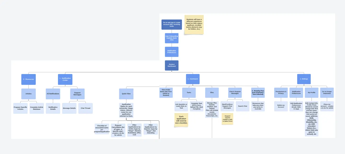
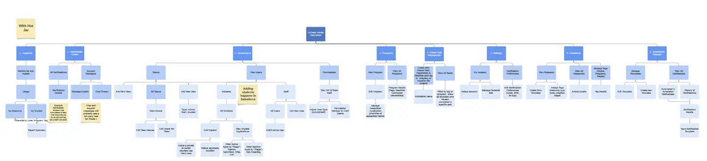
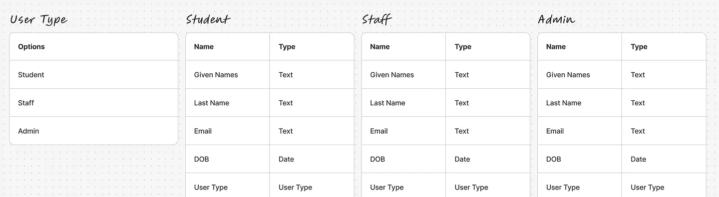
Early in the process, it was clear there’d be a need for three user types. We looked at how students worked through the process and did not see enough differentiation to justify multiple different user types. However, with staff accounts there was a clear distinction between a person’s role in their user behaviours and actions. We designed one for students and two for staff. Various pages would not be visible to students. Some features would need to be segmented depending on the type of staff you are.
Design
The primary goal of the OzTREKK Student Portal was to create a centralized experience for students applying to Australian universities. The design needed to reduce confusion, improve task visibility, and support better communication between students and advisors.
From a business perspective, the portal also needed to streamline internal workflows, reduce manual tracking, and scale effectively across multiple programs and partner schools. These goals guided every design decision we made, from layout and interaction patterns to design system planning and component reuse.
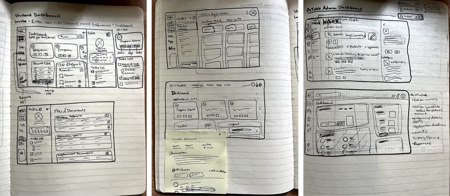
Abstract Concepts and Paper Sketches
Early in the design process, our team started ideating various concepts with paper sketches. We explored different layouts and looked for different ways to present large lists of information.
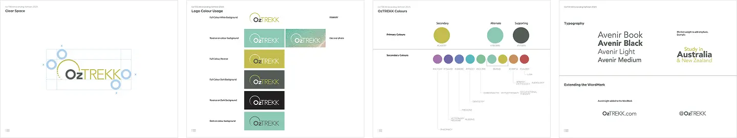
Designing in the Midst of an Evolving Rebrand
One of the biggest challenges we faced during this project was designing the app and establishing a design system in parallel with the company’s mid-cycle rebrand. The company rebrand started shortly after we began working on this project, with brand guidelines being released incrementally. We would see revisions to the new brand guidelines along the way. This meant we had to frequently update components, colours, and typography multiple times as changes were made to the evolving visual identity.
To stay on track for our fixed launch timeline, we had to carefully balance implementing the most up-to-date elements of the new brand while still relying on some legacy assets from the old one. This created a temporary state where the product and it’s design system had to coexist between two brand guides. Our team worked strategically to ensure the app still felt visually coherent and brand-consistent, while also building in flexibility for the final brand guidelines to be applied once fully available. We used Bubble.io as the source of truth for the product’s design system. Thankfully all the core components and primitives we needed to change frequently were setup as variables, data types, or reusable components. This saved our team countless hours in revisions.
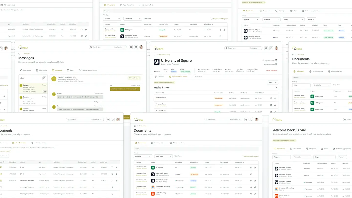
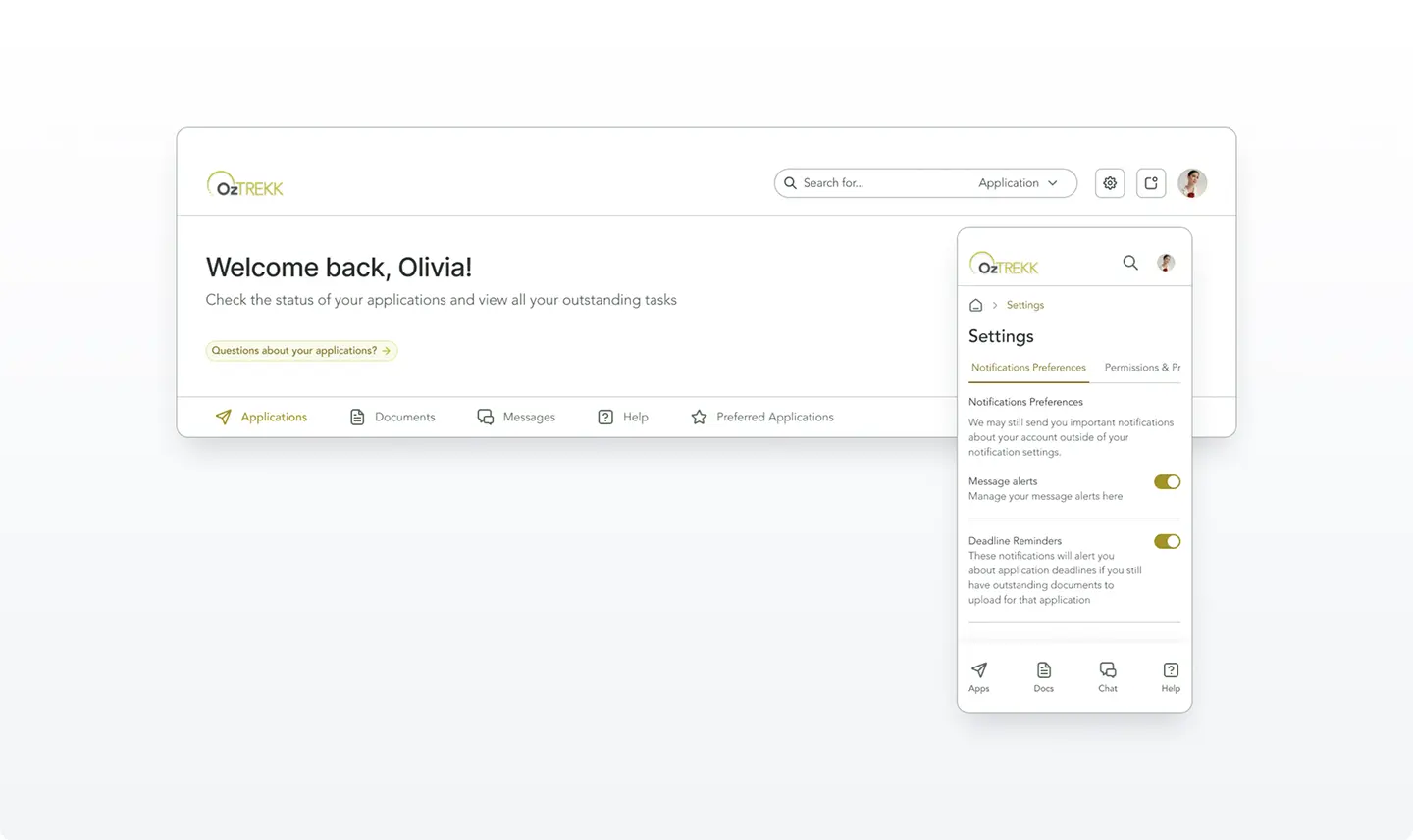
Student Dashboard
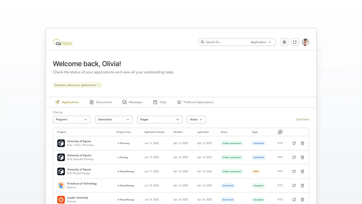
The student dashboard was designed to provide a clear, centralized view of each student’s application status, remaining tasks, and upcoming deadlines. On page load, users are presented with a welcome message, context about what they can do on the student dashboard and an inviting button that offers support for questions. We wanted the as many applications visible above the fold as possible so we kept the content on this page fairly minimal. The design of this page worked well even on ultra-wide format displays.
Navigation Structure
We decided a horizontal UI made the most sense for this app. The navigation and page structure of this app wasn’t overly complex, which made it difficult to justify taking up horizontal screen real estate with sidebar navigation.
Our team did a lot of secondary research and some testing on cognitive load and scalability between a horizontal and vertical navigation designs. Users (at least in North America) are able to scan and process information quickly when it is presented from left to right. We consistently found users were able to figure out where to navigate quicker when nav items are presented in a row.
On mobile, we used a combination of: breadcrumbs, horizontal tabs, fixed nav bars.
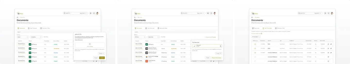
Document Upload & Checklist
The documents page followed the same page structure and hierarchy as the student dashboard. We wanted to maintain consistency and brand identity across the app.
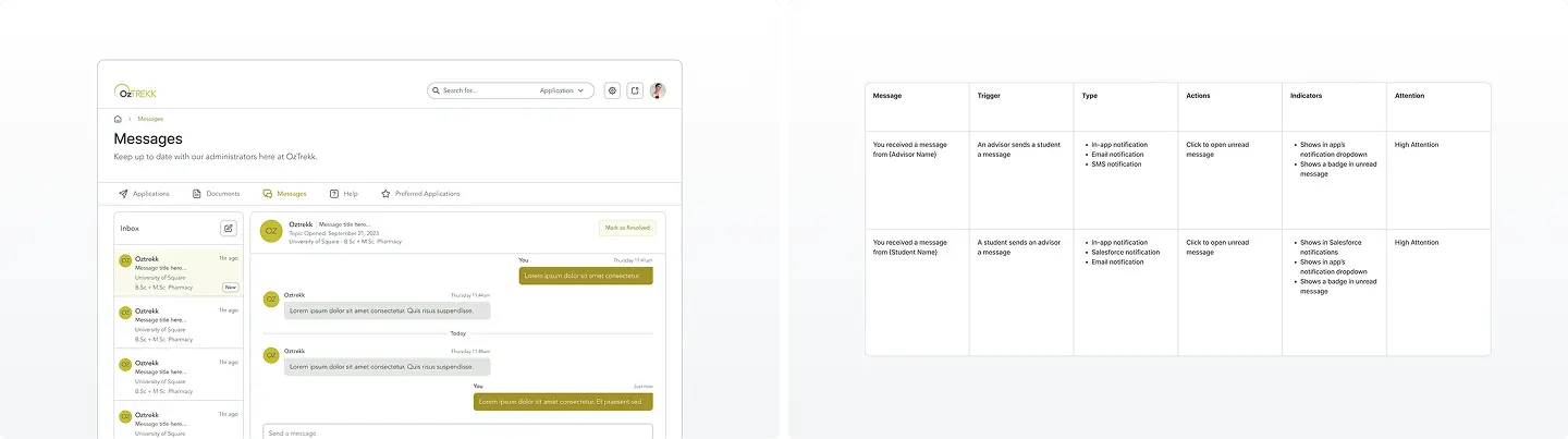
Messaging & Notifications
Messaging and notifications are two of the most important features of the app for a student. We made sure the design of the messages page was familiar to other apps to minimize onboarding time and user errors.
We tracked all the notifications the app need in a spreadsheet. It took the team days to find all the notifications the app would need and how we would want to present them to the correct users.
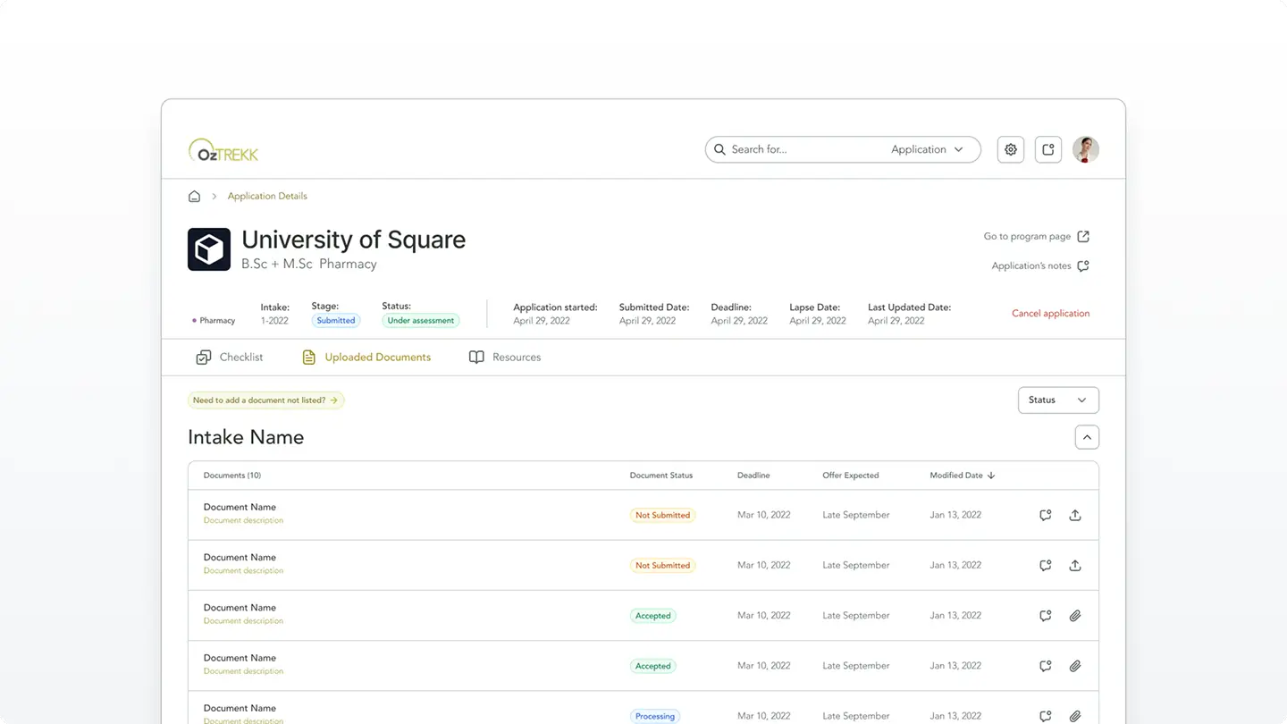
Application Details
Applying to university programs can be overwhelming for students, especially when juggling multiple applications and requirements. To reduce cognitive load and make the process feel more manageable, we used tables to present key action items and resources. Tables offered a clear, scannable layout with a natural reading flow, helping students quickly understand what was required at each step.
One of the more complex challenges was handling multiple intakes per program. Each intake could have different requirements. While some intakes shared the same document needs, others had unique criteria. To streamline the experience, we designed the system to automatically detect and reuse documents or completed actions across applications, so students wouldn’t need to repeat tasks they had already completed. This reduced redundancy, minimized confusion, and made applying to multiple programs feel significantly more intuitive.
Retrospective
We successfully handed off the designs to development in 2024. Shortly after, I moved on from my full-time position and decided to pursue freelancing. This gave me the flexibility to continue contracting and providing support to the developers on an as-needed basis. Having kept in touch with the developers, I’ve been pleased to hear over 1,500 users were onboarded in the app in less than a few months. I’m super proud of the work our team accomplished! Here are some of my key takeaways:
Functional prototypes are a game-changer!
Using Bubble.io (which also hosted the source of truth for our design system), we built the bones of the app with real dynamic data in a live database. We were able to create all the logic and flows we wanted the developers to see. In the past, using clickable prototypes in Figma didn’t always provide all the context our developers needed. We’d need multiple kickoff calls and a ton of documentation. Building in Bubble.io allowed us to demo exactly what we wanted without needing to touch a line of code. This saved our design teams hours in meetings and documentation. This also gave our developers a lot more clarity than they are used to seeing.
Stakeholder interviews are so important
In an app as large as this with so many moving pieces, it’s so easy to get lost or confused along the way if we only had a project brief. The interviews revealed pain points that might not have been obvious or immediately visible.